sBooks Bookstore Checkout Flow
sBooks is a small online bookstore focused on creating a tailor-made journey with powerful filters, personalized recommendations, and a beautifully responsive design that adapts to your device, making every visit a delightful escape into the world of books.
This chart illustrates the design process used while working on sBooks.

An example of one of the personas created for this project.

Kevin is tired of overly cluttered mega-sites such as Amazon that sell everything and wants a simpler, book-only experience. Additionally, he wants to know that the money he spends will support smaller, more local businesses.
Focus on creating a “local bookstore” experience. It is probably worth brainstorming how to make the recommendations feel more personal to the user, like the kind of experience you get when walking into a traditional bookstore and ask the staff about the books they would recommend.
An example of Kevin’s user journey.

The first iteration for the Information Architecture was organized according to this sitemap. Small adjustments were made by the end.

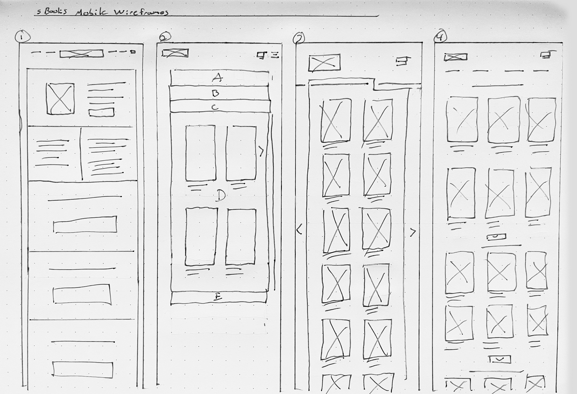
Taking the time to draft iterations of each screen of the checkout flow on paper ensured that the elements that made it to digital wireframes would be well-suited to address user pain points. For the home screen, I eventually decided on a card style layout to organize the various sections for authors, events, and book categories.
It was also concluded that the card layout word work well for different screen-sizes including mobile. For the remainder of this summary, I will focus on the desktop version.


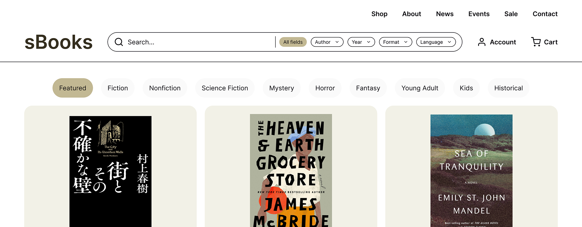
As the initial design phase continued, I continued to iterate using digital wireframes and low-fidelity mockups. After about 4 iterations, I decided on the following design.


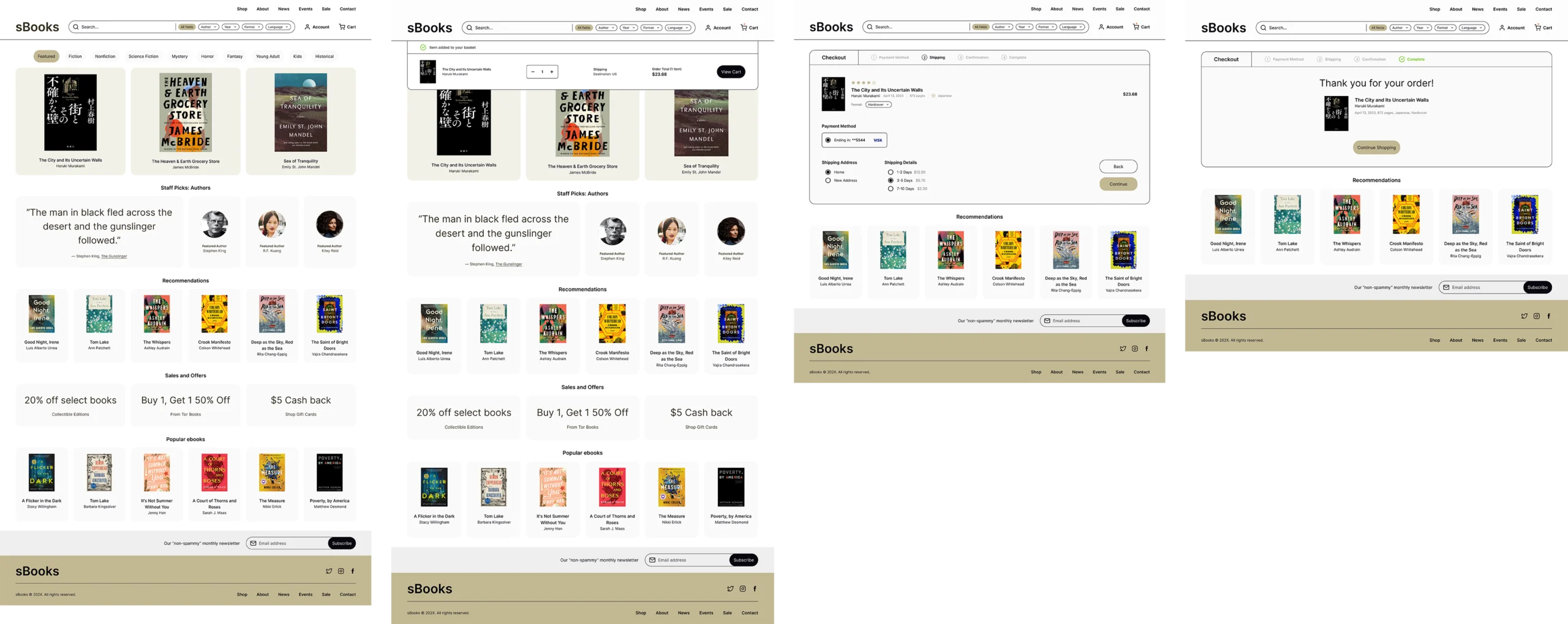
The final high-fidelity prototype following the entire checkout flow.

